I see more and more people sighing on Twitter about Tailwind becoming the new Bootstrap. That they can “smell” Tailwind right away when looking at a website.
This bugs me because I really like Tailwind, and while they’re somewhat right, they’re not completely right.
You see, what many don’t know is that Tailwind has two versions for two different needs. What they see is usually one version, then conclude that Tailwind is yet another Bootstrap-y framework.
So, I want to clear the confusion a little bit.
Tailwind CSS
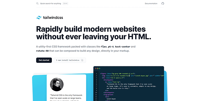
Tailwind CSS is a utility-first CSS framework. This means that it only offers utility classes (e.g. p-5, flex, text-center), nothing pre-styled; not even headings or links. You basically have to create everything from scratch, giving you the opportunity to create something unique.
For example, if you want to add a button in Tailwind CSS, you won’t find btn btn-primary classes or something like that. You have to create the button using utility classes, such as padding, color, font, etc.
Here’s an example:
<button class="bg-yellow-500 text-white uppercase font-bold px-5 py-3 hover:bg-yellow-600 rounded">
    Click me
</button>
You add every utility class that you need to create a button, including hover effects, transitions, breakpoints, and so on.
Yes, there are a lot of classes, but (1) who cares, and (2) for elements that you’ll keep repeating, such as buttons or links, you can create a semantic class and use that everywhere.
For example, you can take all those pre-existent utility classes from the above example and put them into btn btn-primary classes.
@layer components {

    .btn {
        @apply uppercase font-bold px-5 py-3 rounded;

    }

    .btn-primary {
        @apply bg-yellow-500 text-white;
    }

    .btn:hover {
        @apply bg-yellow-600;
    }
}
Or, you can create one big btn class and put them all there, including hover effects starting with Tailwind CSS 2.0. Personally, I like to break them down a bit.
Now, whenever you want to add a button to your design, you don’t have to add all those utility classes. You only add the one(s) you created, such as btn btn-primary.
This utility-first technique offered by Tailwind CSS, without any pre-styled components, allows you to create unique designs. It would be virtually impossible to recognize a website created with Tailwind CSS unless it copied styles from somewhere else.
I revamped my personal site (currently turned into this blog), Radu.link, with Tailwind CSS. It was previously made with Bootstrap.
I don’t think you can tell that it’s made with Tailwind CSS without looking at the source code.
Tailwind UI
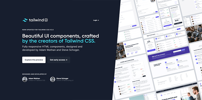
Tailwind UI is what’s used when people “smell Tailwind” while looking at a website. That’s because it offers pre-styled components, such as hero sections, CTA sections, testimonial sections, and more. Of course, the components are based on the utility classes from Tailwind CSS.
These pre-styled components can further speed up the website creation process, and some web developers prefer this method. But then, obviously, more and more websites will look the same. This is when Tailwind becomes more or less another Bootstrap-y framework.
Also, Tailwind UI is not free. So, if you don’t want to get your hands dirty, you need to pay. 😃
Conclusion
Use Tailwind CSS for a unique design created from scratch. Use Tailwind UI for faster development with pre-styled components, but risk having people say that you have a “smelly” website. 😃
If some info is outdated or incorrect, or you have anything to add, say or ask, please contact me via Twitter or email.